If you are new to films from the silent era, you may have noticed a distinctive look to the image, or depending on what you’ve seen, even thought the films look bad due to early technology being primitive and incapable of any level of quality. There are numerous reasons why films from the silent era look different even from films that came shortly after in the early 30s, some are inherent, some are not. We will be looking at both of these things, how silent films looked originally, versus how they sometimes look today due to shortcomings and challenges of previous conservation and preservation.
ORTHOCHROMATIC FILM
One of the most fundamental differences between the imagery of most films from the silent era and the sound era is a matter of film stock. Most photographic film produced for stills or motion pictures until the early 1930s was what is called orthochromatic. This means the film is only sensitive to a limited range of the spectrum of light: ultraviolet, blue, and green (which was an improvement over the earliest photographic emulsions only sensitive to ultraviolet and blue).
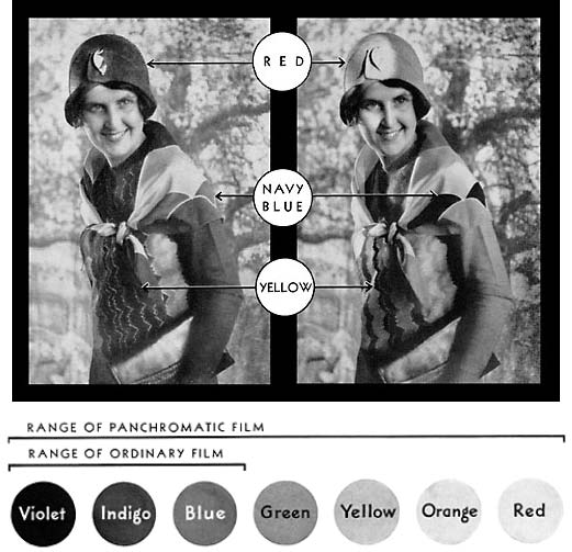
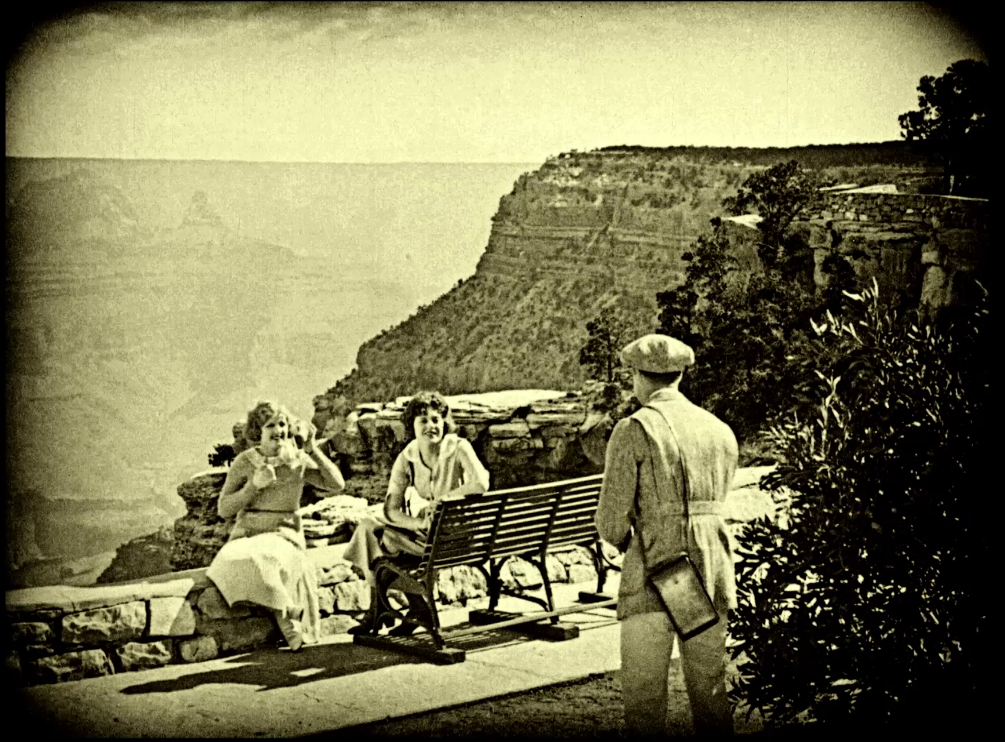
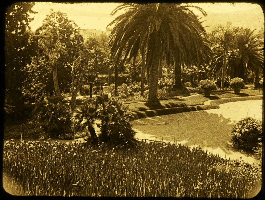
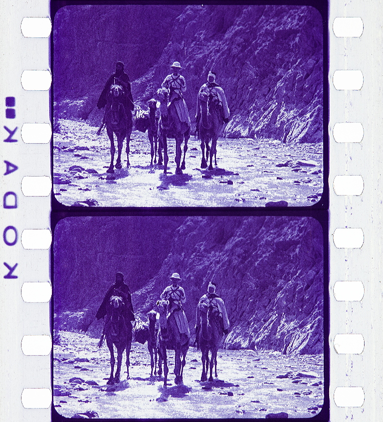
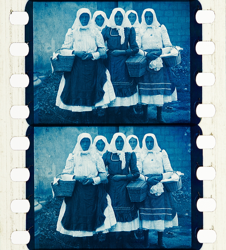
Qualities characteristic of scenes shot on orthochromatic film are very light or entirely white skies, increased atmospheric haze in landscape shots, accentuated texture (you may notice people’s hands can look especially rough in silent films), and the fact that, since it is insensitive to yellow, orange, and red, these photograph much darker than they appear to the eye. This balance of shades tends to lend itself to images of greater contrast, giving images reminiscent of steel engravings or pen and ink illustration, common in print media of the 19th and early 20th century. Panchromatic film, which is sensitive to the entire color spectrum, appeared in the first decade of the 20th century, but would not be widely available, particularly for amateur use, until the late 1920s. Panchromatic film renders its subjects much more realistically, with darker skies and a greater graduation of greys.

As it sometimes happens, you get several technological shifts occurring almost simultaneously. Along with the movies getting a handle on sound technology due to competition from radio, in the late 1920s Kodak developed formulations that brought the cost of panchromatic film down to nearly the same price as orthochromatic, and ortho was abandoned fairly quickly, with Kodak discontinuing their ortho motion picture camera stocks in 1930, the year Hollywood went nearly 100% talkie.
More orthochromatic visual samples

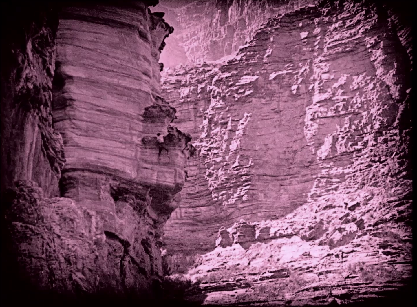
Three frames from Sky High (1922) with Tom Mix, illustrating the atmospheric haze, light skies, and tonality typical of orthochromatic film shot outdoors. (sourced from the Undercrank productions Blu-Ray)
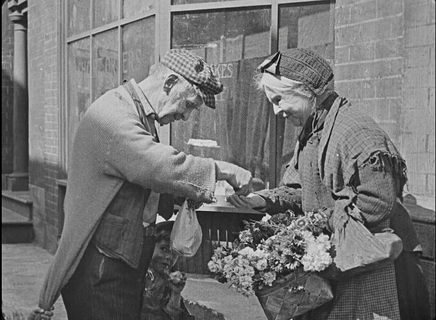
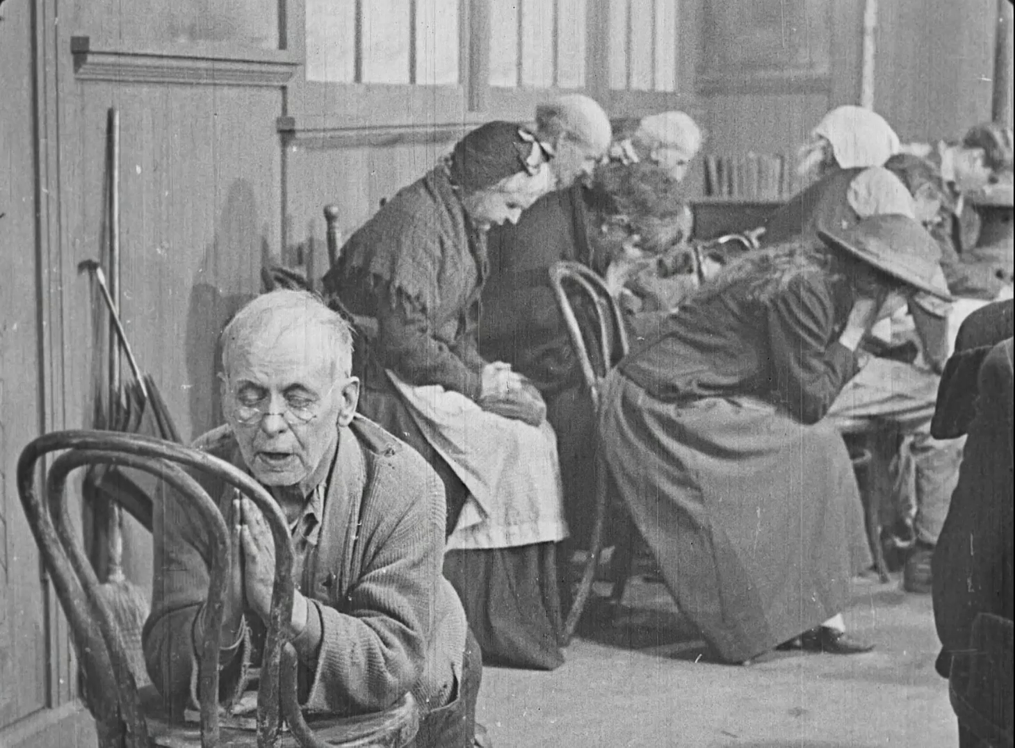
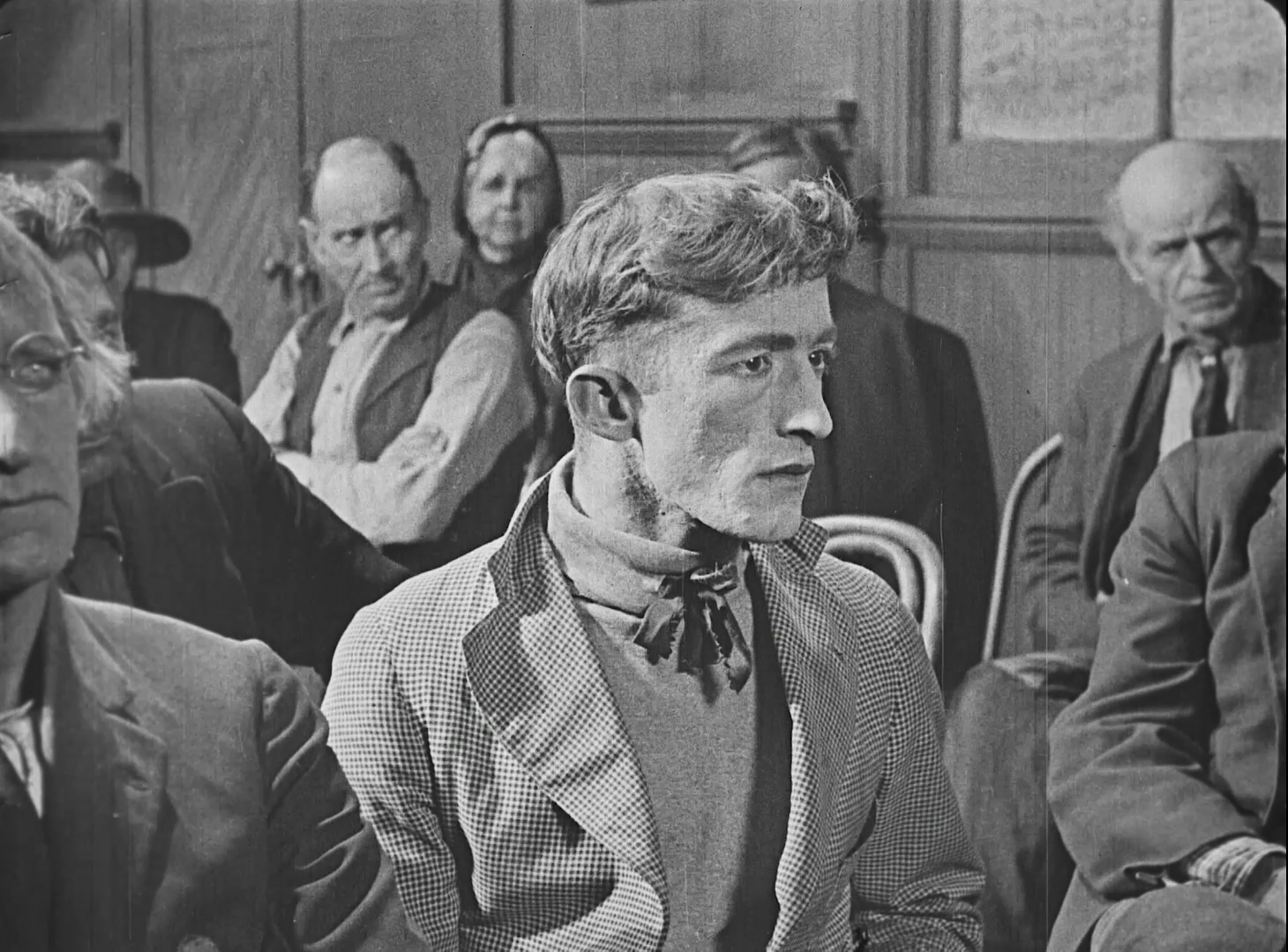

Four frames from Virtuous Sinners (1919), highlighting orthochromatic film’s tendency to enhance or even exaggerate the texture of surfaces and skin. (Sourced from Flicker alley’s Rudolph Valentino collection Vol. 2)
COLOR IN SILENT ERA
Applied Color
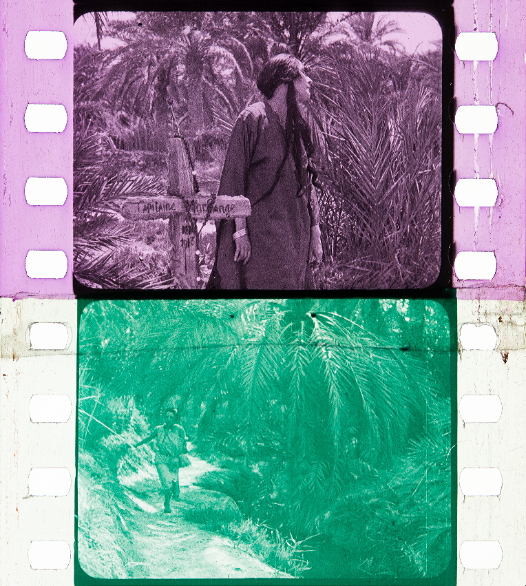
A quality not readily associated with old films is that of color. But color of some kind by one method or another was a common feature almost from the beginning. George Melies sold his films in two versions, one black and white, and one handcolored, with the latter being 2 times the price. (Samples in this section from the Timeline of Historical Film Colors)
Handcoloring for scenes would soon give way to stencil processes, which gave more regular results. France and Italy would make great use of the stencil color into the sound era. The US never bothered with the stencils, but the Handshiegl process was used similarly for limited use of applied color. It was developed for Cecil B. DeMille’s 1916 production Joan the Woman by engraver Max Handshiegl and DeMille’s cinematographer Alvin Wykoff.


Natural Color
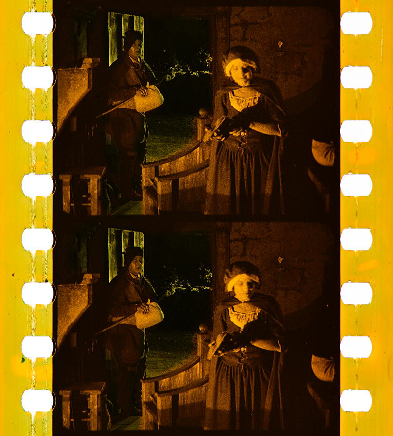
The US was quick to embrace the early attempts at natural color. All the successful early color processes utilized a limited color palette derived from the combination of red and green, red/orange and blue/green, or some variation. Think of the color modes in computer displays and printing: RGB (Red, Green, and Blue) and CMYK (Cyan, Magenta, Yellow, and Black), these are able to reproduce the full spectrum. The problem with color for cinema was capturing the necessary color information simultaneously, and finding a way to project it on screen. The initial comprimise was sacrificing the yellow/blue end of the spectrum, and capturing red and green records sequentially, one after the other. Two early processes successful with this arrangement were Kinemacolor and Prizma. Both shot with panchromatic black and white film exposed through a rotating filter in front of the camera lens, at 32 fps, double the normal shooting speed of 16 fps.
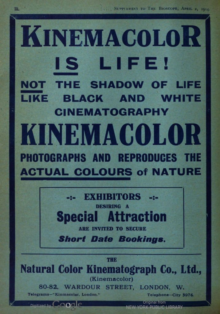
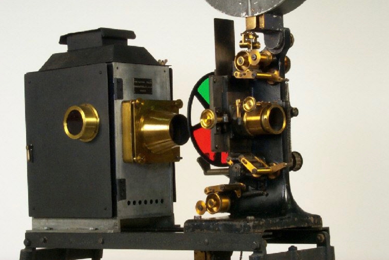
Kinemacolor required a special projector and distribution was limited. Incorporated in 1908, the company folded by 1914. The refined process of the Prizma corporation introduced in 1919, utilized a double sided film that could be run through a standard projector. But both Kinemacolor and Prizma, due to being sequential exposure processes, had the problem of color fringing with fast movement.
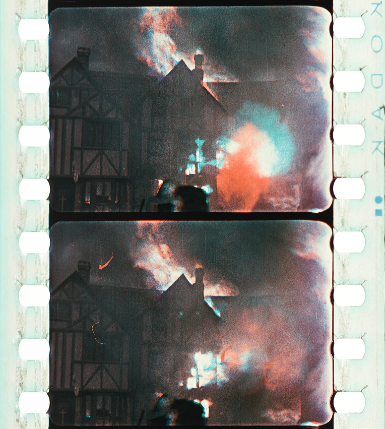

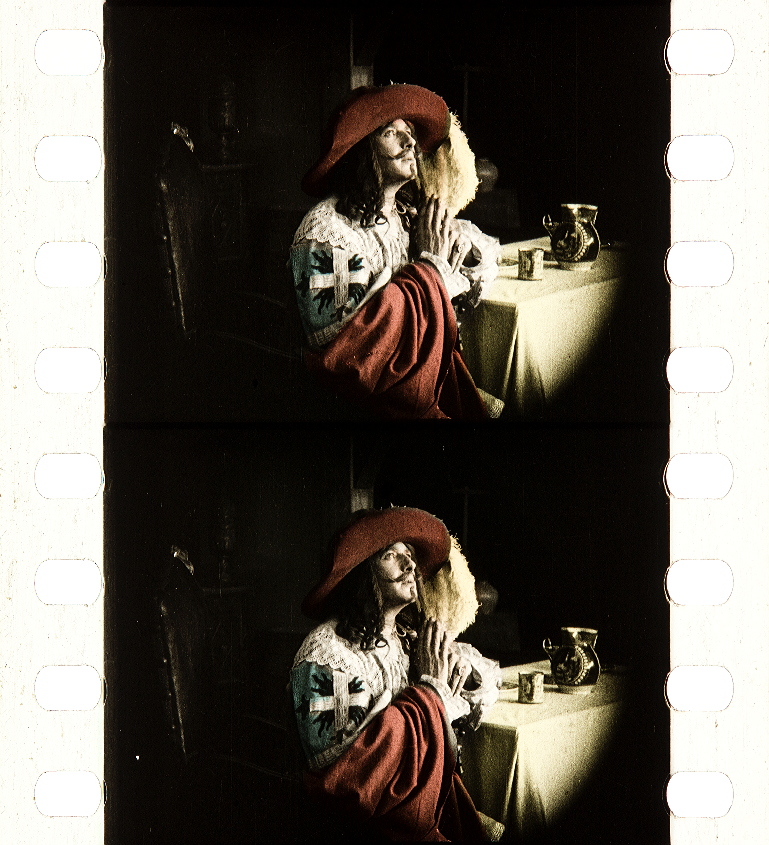
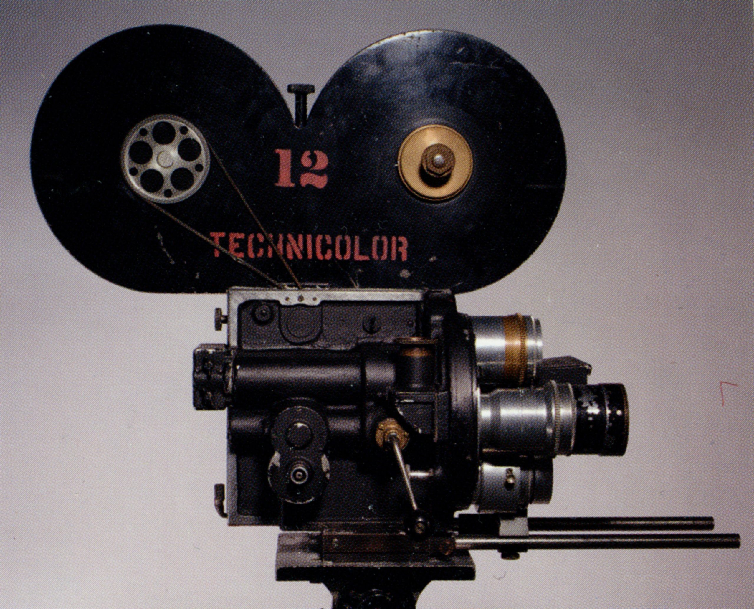
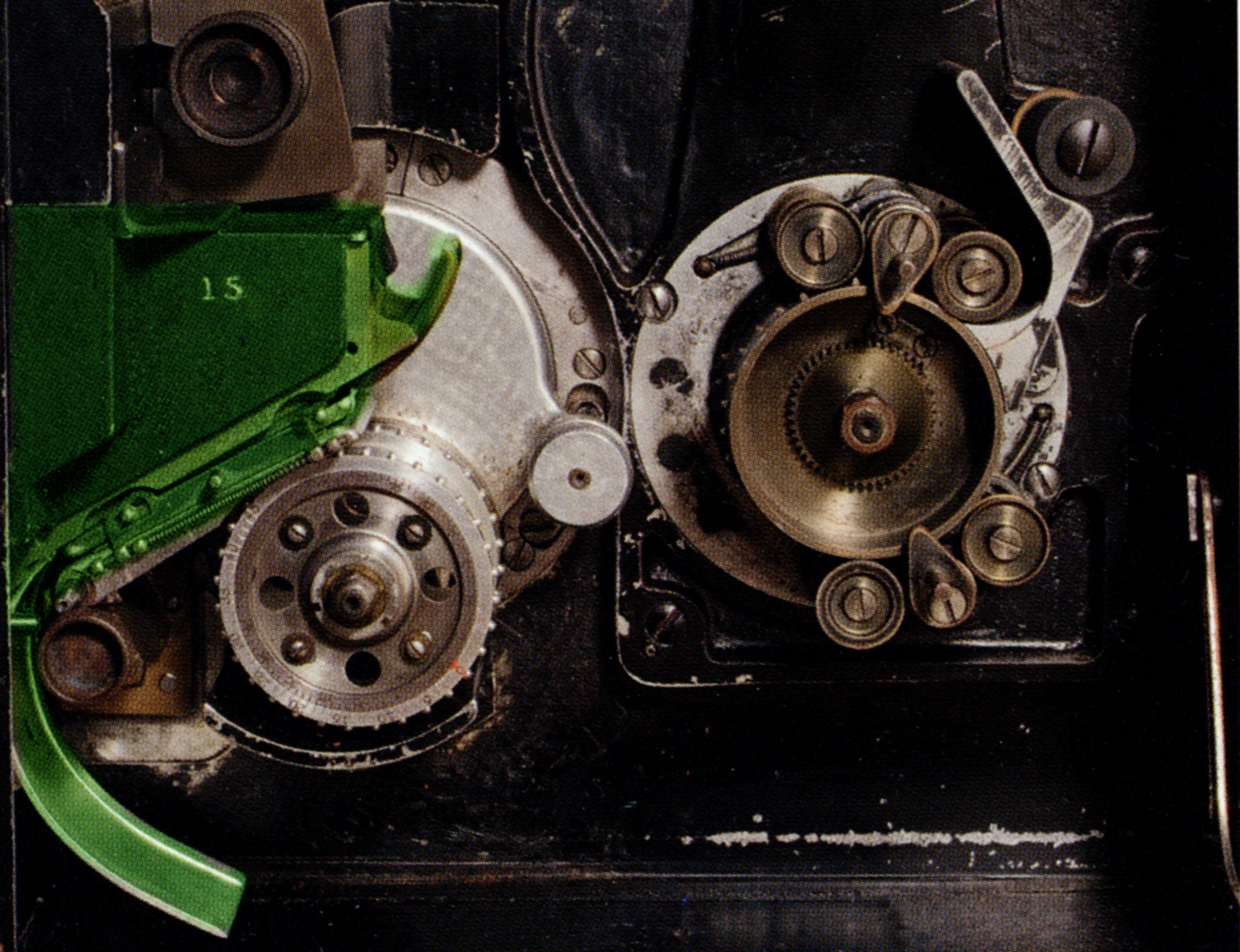
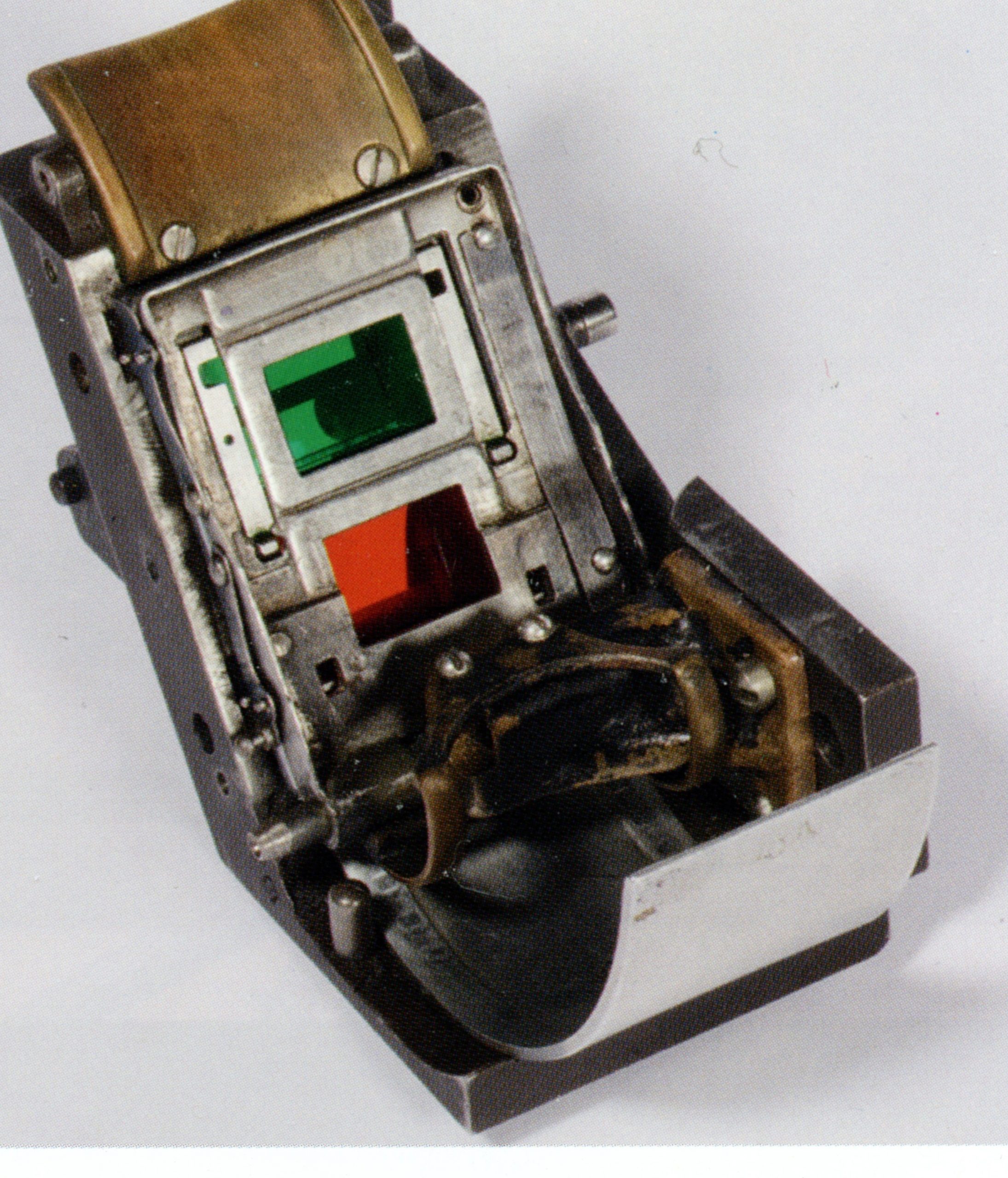
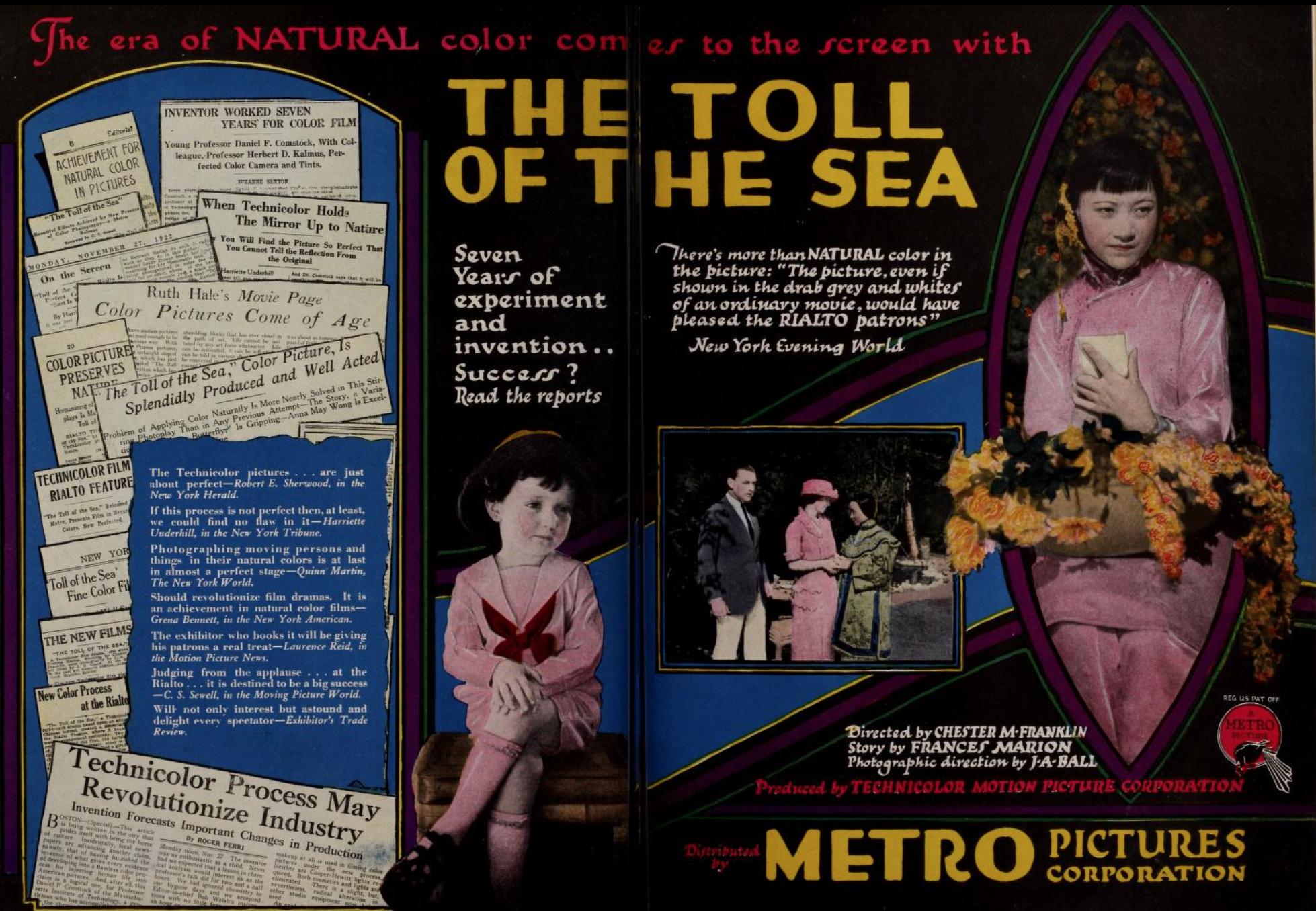
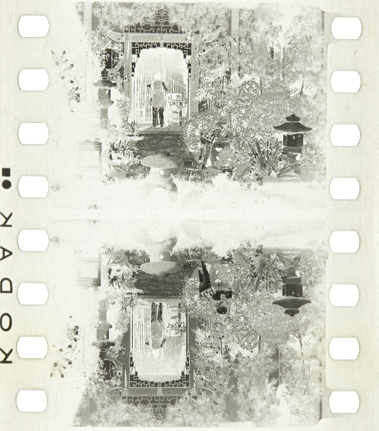
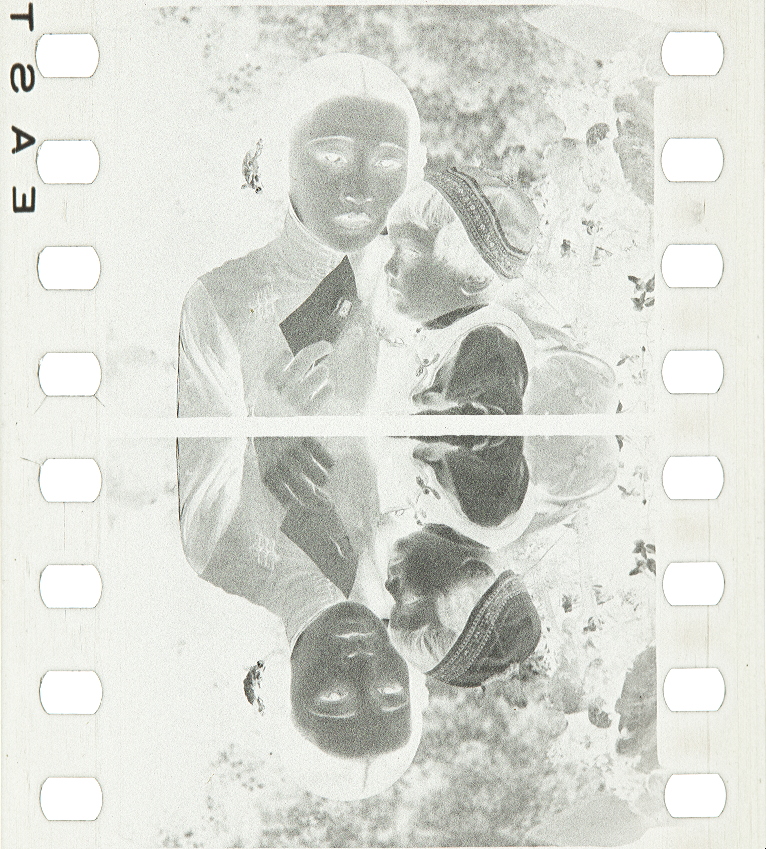
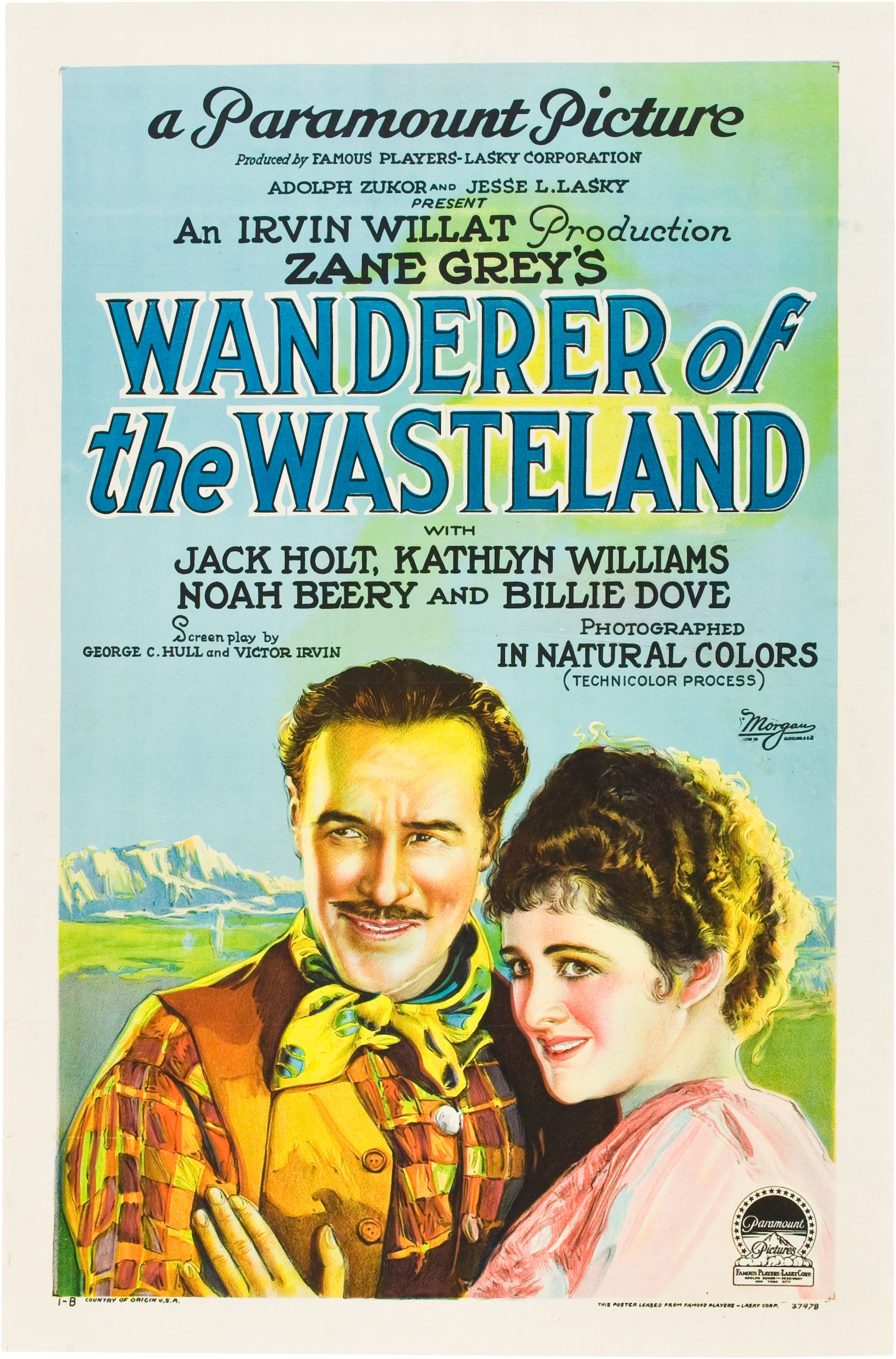
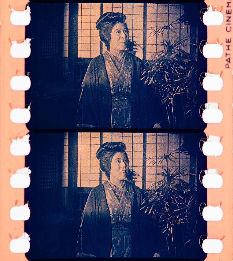
Technicolor, a corporate name you are likely familiar with (perhaps used as an adjective implying vividness), incorporated in 1915, proved the commercial viability of their refined process in 1922 with their feature production The Toll of the Sea, an adaptation of Madame Butterfly, with the action moved to China instead of Japan. In the technicolor II process, the image passed through the lens, into a beam splitter, through red and green filters, registering 2 frames at a time on the negative. (Images from The Dawn of Technicolor by David Pierce and James Layton.) Prints were made by printing the red and green records separately onto half thickness films which were then toned their relative colors, and cemented together. By 1926 Technicolor introduced their dye imbibition printing technique, which worked similar to lithography, which applied layers of dye from printing matrices for each color record, forming the image. This printing process, with refinements would be used by Technicolor until the late 1970s. Technicolor had more or less won out over the other processes by the mid 20s, and from 1923 onward in Hollywood, would be used for select scenes in prestige productions, within otherwise monochrome films. Entire features shot in color would be sporadic until the end of the 1920s.


other technicolor features of the 1920s

tinting and toning
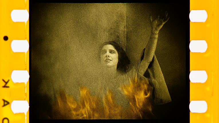
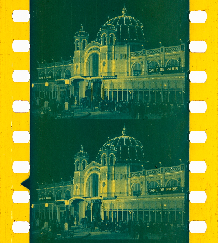
But more common than color used to render scenes realistically, was color used to suggest atmosphere or mood. Tinting and toning are two related but different processes which were used in this way. Tinting gives an overall color to the image by immersing the film in a dye bath, staining the gelatin emulsion on the film base. Toning is a chemical process which bleaches out the silver halide image from the emulsion, replacing it with a colored metallic compound. The resulting image differs from that of a dye tint in that the whites remain white, and the dark areas of the image are colored. Tinting and toning could also be combined for dramatic effects. Blue tone with a pink tint was often used to suggest early morning or early evening. In the last sample below, blue tone with a yellow tint is used to suggest the glow and warmth of electric lights at night. Elaborate tinting and toning peaked in US films in the mid 1910s thru the early 20s. By the late 20s, you were likely to have an occasional scene employing a tint, with the main body of the film printed in B&W. (All samples from Timeline of Historical Film Colors.)


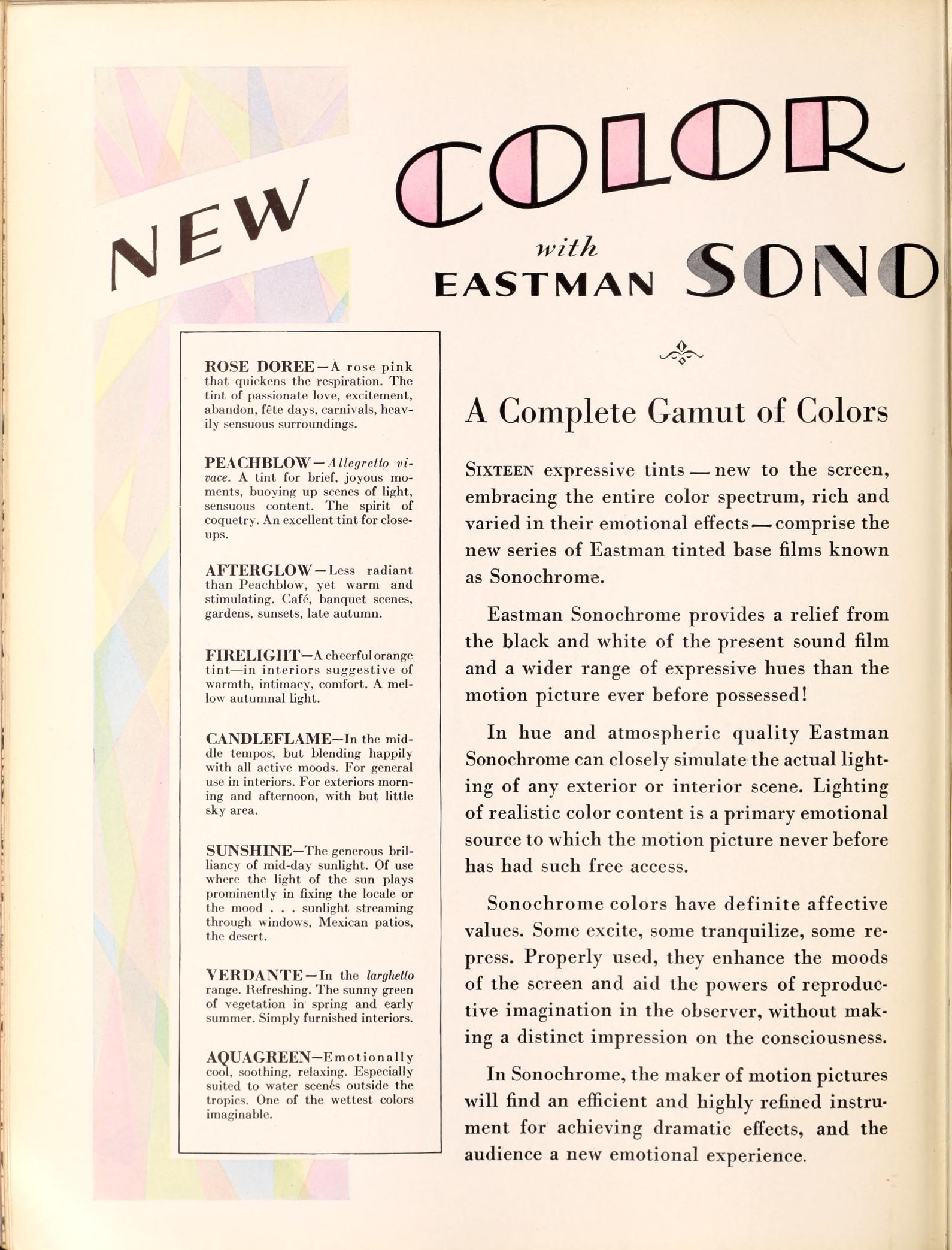
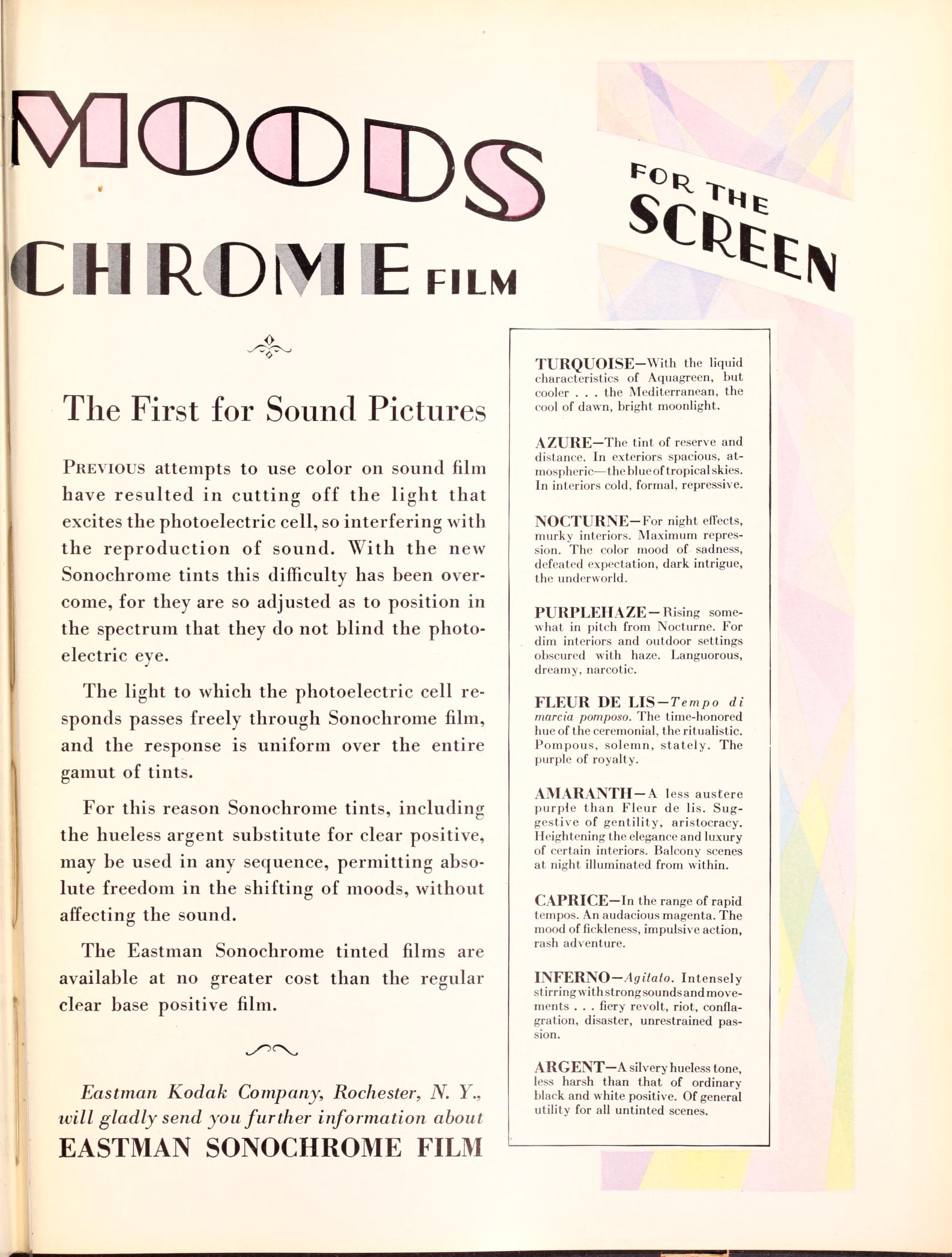
As an aside, It had been taken as fact for years that tinting and toning died out in the sound era due to tints interfering with the soundtrack being read by the optical pickup, but research by Anthony L’Abbate of the George Eastman Museum has proven this false. It continued as an occasional special feature of a scene, entire reel, or entire feature. Kodak introduced pre-tinted Sonochrome positive print stocks at the dawn of sound, which continued to be available until the late 1960s. However these were only featured on original release prints, which generally do not survive, nor does the documentation on how the release prints were printed by the laboratory. The subsequent re-releases theatrically and on video of studio films of the 1930s and 40s have always been straight black and white. A major exception is the sepia toned framing scenes of The Wizard of Oz in the more recent video editions. But for some known examples, the 1931 Dracula was originally released on green tinted stock, Fox’s 1933 attempt to bring Continental star Lillian Harvey to US audiences, I Am Suzanne, featured multiple tints throughout, and many of MGMs prestige pictures of the late thirties like The Good Earth and Girl of the Golden West, were sepia toned throughout. MGM’s laboratory head John Nicholaus was quoted by International Photographer in March 1938 (p.29) that the purpose of toning “is not in any sense, nor was it ever intended to be, a substitute for color. Its sole purpose is to get away from the harsh coldness of straight black and white and create a pleasing but unobtrusive effect of rich photographic values.”
Thank you for reading to the end of this post. This subject will be continued in Pt. 2, where I will be discussing silent era laboratory work.